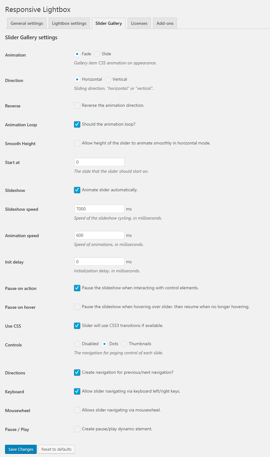
The Slider Gallery extension enables users to configure its general settings from the Responsive Lightbox settings screen. To access the extension’s settings panel navigate to Settings > Responsive Lightbox from your WordPress site’s admin panel.
Now, click on the Slider Gallery tab to begin configuring Slider Gallery’s settings. Here’s a preview of the default Slider Gallery screen followed by a detailed explanation of the different settings you can configure.

2.1 Animation
The animation setting allows you to define the CSS animation style that should be applied to your slider gallery’s gallery item on appearance. You can choose to apply either a fade animation or a slide animation.
2.2 Direction
With the direction setting, you can configure the direction in which the slider gallery’s gallery item will move in. You can choose to have the gallery item slide horizontally or vertically. This setting only takes effect when the Animation value is set to Slide.
2.3 Reverse
By ticking the Reverse the animation direction box, the direction of the gallery item will be reversed. For instance, if you set the Direction setting to Horizontal and the gallery item slides left to right, by enabling this option the gallery item will now slide from right to left. Similarly, if you set the Direction setting to Vertical and the gallery item slides up and down, by enabling this option the gallery item will now slide from down to up.
2.4 Animation Loop
Enabling the animation loop option makes the CSS animation applied to the gallery item repeat continuously. By default, the animation loop is enabled.
2.5 Smooth Height
Enabling this option makes it so the height of the slider animates smoothly when in horizontal mode. This setting only takes effect when the Direction value is set to Horizontal. By default, the smooth height option is disabled.
2.6 Start at
The start at option allows you to define the slide that the slider should start on. By default, the start at option is set to 0 which means that the slider will start from the first gallery item.
2.7 Slideshow
The slideshow option allows you to set the slider to animate automatically when the user launches the gallery item in a slideshow. By default, this option is enabled.
2.8 Slideshow speed
With this slideshow speed option, you are able to set the speed at which the slideshow transitions. The value should be specified in milliseconds. By default, the slideshow speed is set to 7000ms.
2.9 Animation speed
The animation speed setting allows you to define how fast the animation effect should be. The value should be specified in milliseconds. By default, the speed of animation is set to 600ms.
2.10 Init delay
With the initialization delay option, you are able to define how long to wait before the slideshow loads. The value should be specified in milliseconds. By default, the initialization delay is set to 0ms which means that the slideshow loads right away.
2.11 Pause on action
Enabling the pause on action option makes it so when the user interacts with any of the control elements, the slideshow will automatically pause.
2.12 Pause on hover
Enabling the pause on hover makes the slideshow pause when the user is hovering over the slider area. When the user stops hovering, the slideshow resumes. By default, this option is disabled.
2.13 Use CSS
By enabling this option, the slider will check to see if any CSS3 transitions are available and use them.
2.14 Controls
The controls option lets you select the navigation for paging controls of each slide. You can choose to display dots, thumbnails, or disable the controls.
2.15 Directions
The directions option allows users to display navigation for previous and next navigation. By default, this option is enabled.
2.16 Keyboard
By enabling the keyboard option, users will be able to navigate through the slider using their keyboard’s left and right arrow keys.
2.17 Mousewheel
By enabling the mousewheel option, users will be able to navigate through the slider using their mousewheel. This option is disabled by default.
2.18 Pause / Play
Enabling this option creates a dynamic pause/play element for users to interact with.


Leave a Reply